

420 Medical Cannabis — Brand Identity & Packaging
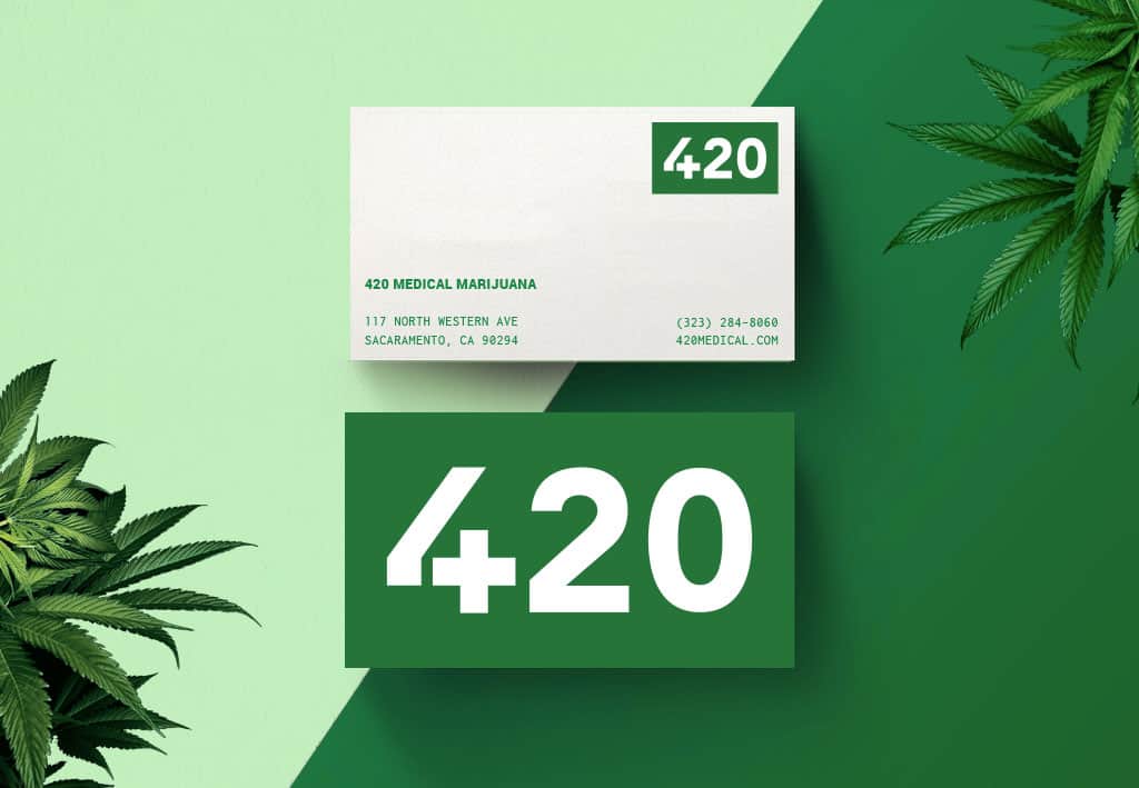
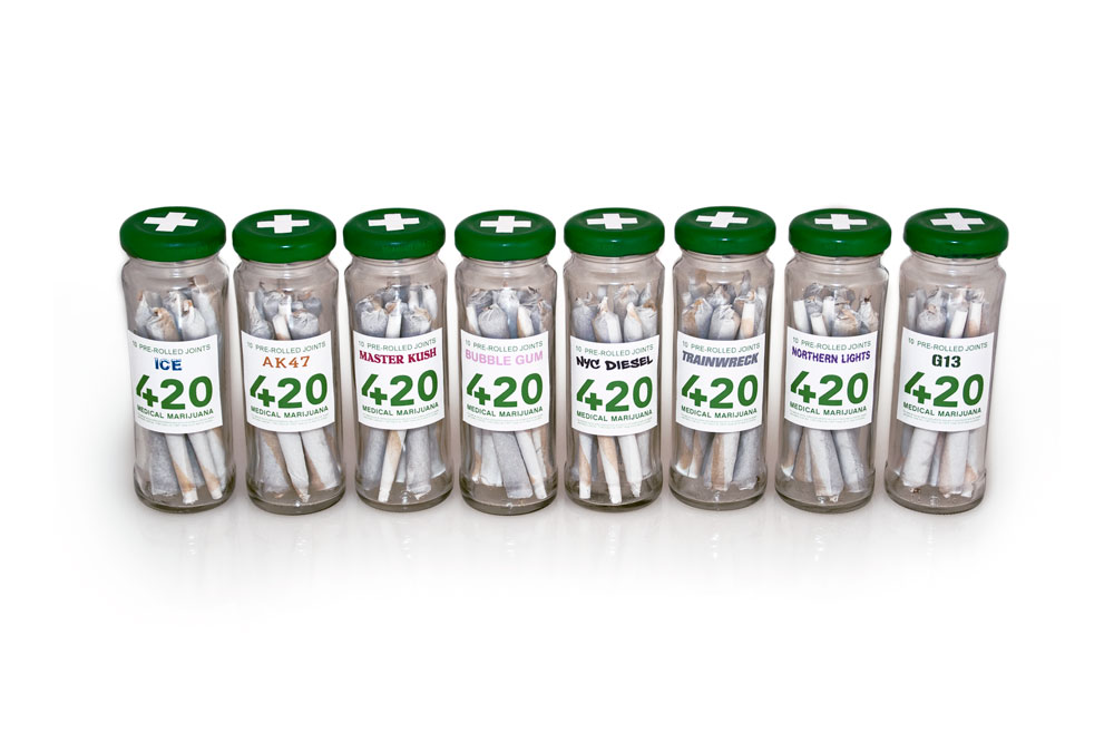
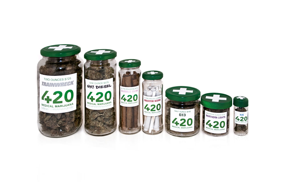
I developed a complete visual identity for 420 Medical Cannabis, spanning branding, packaging, web, signage, and print. The logo transforms the number four into a medical cross, connecting the culturally recognizable “420” with the idea of health and healing.
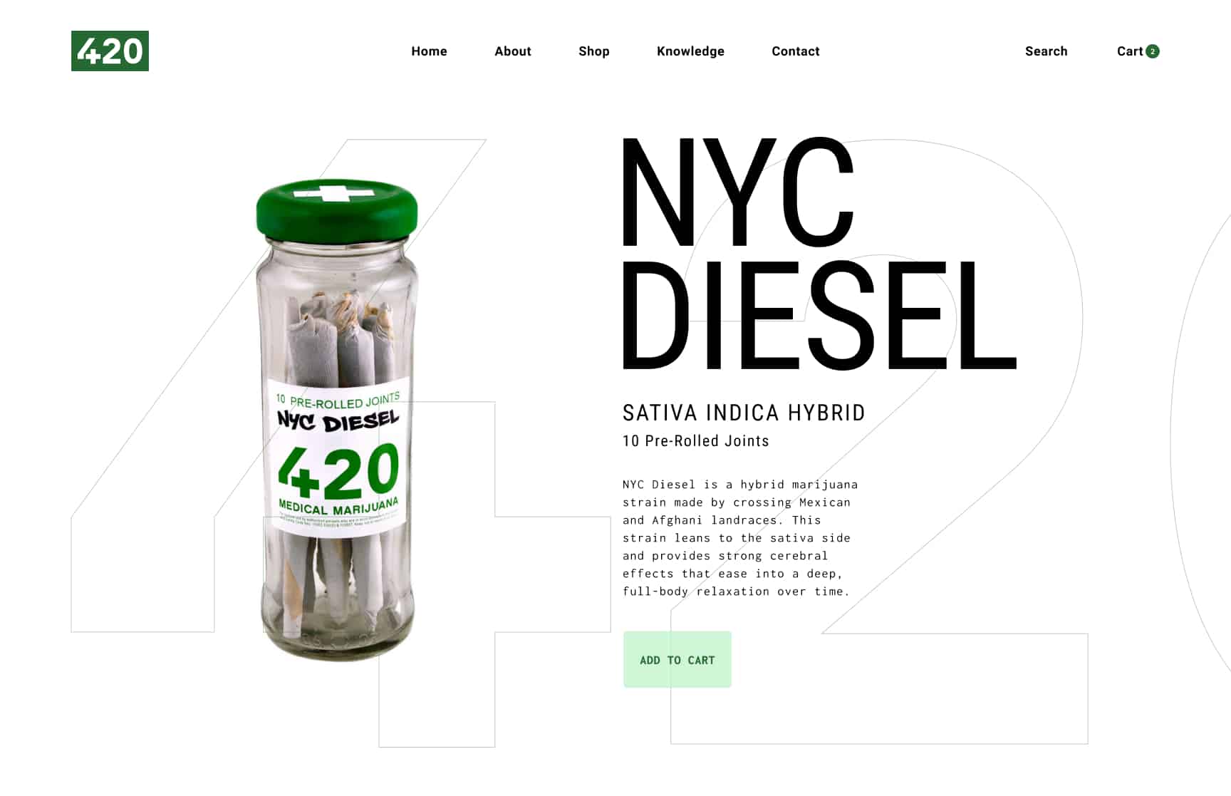
For the packaging, I sourced containers suited to the different products and created a flexible labeling system. Each cannabis strain received its own typography and color treatment, with typefaces selected to reflect the personality of each strain while maintaining a cohesive overall brand.
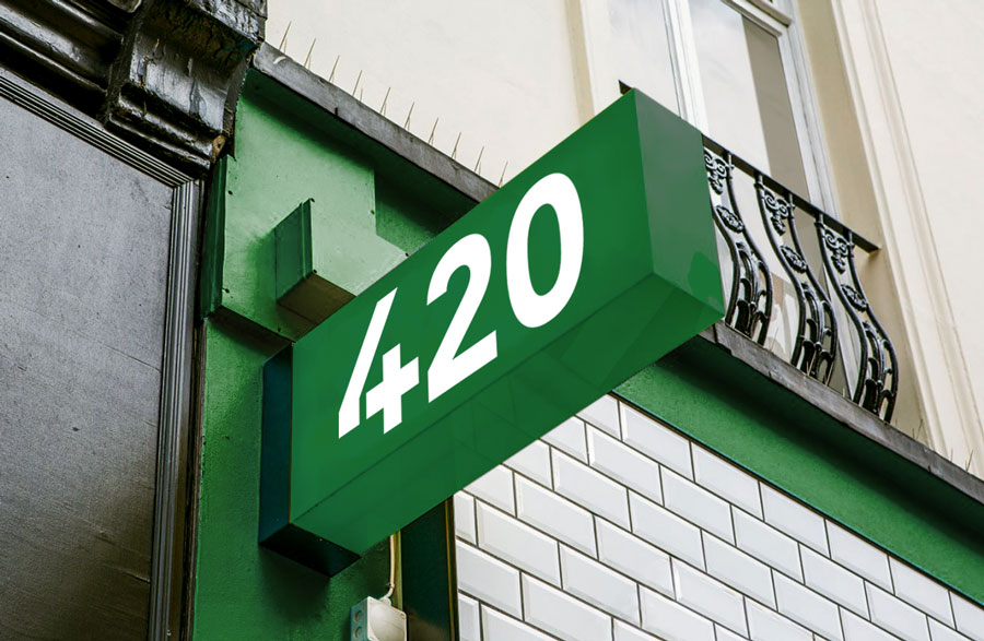
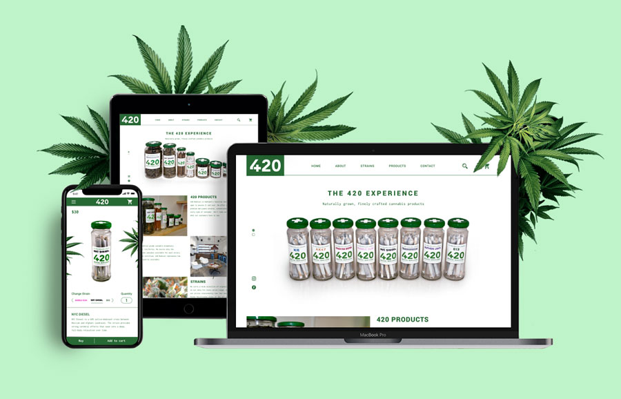
The identity was extended across a responsive website, storefront signage, business cards, digital graphics, and additional brand touchpoints, creating a consistent visual experience from product packaging to retail and digital.